Printable journaling cards are super trendy right now. Several manufacturers are now making their products available digitally and there are tons of free printables throughout the internet. This Project Life resource guide has over a hundred links, including tons of free printables.
After printing out journaling cards at home for the past few months; I decided that the quality of my home printer wasn’t good enough for my albums and so I started getting journaling cards printed here at Persnickety Prints.
At first I didn’t know which of the six paper options would be best for my projects. I printed out the same journaling card (Project Life: Midnight Edition) onto each of the different papers. Depending on your creative style, each of the paper options are perfect for a specific look.
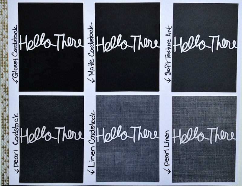
Gloss: Dense and vibrant color. This is my pick for full color filler cards. It stands out in a crowd. If you’re looking for bold and bright. Go with Gloss.
Matte: Similar qualities to Gloss, just with a Matte finish. The color is a little bit less vibrant, but that’s to be expected with a Matte finish. I’m partial to the matte finish on most of my photos. I think it really comes down to personal preference between the two.
Soft Art: My Personal Favorite. I love the feel of the soft art cards. They are less dense and vibrant than the gloss and matte finishes; but when it comes to the cohesiveness of a Project Life/scrapbook album, I would rather my journaling cards ‘fit in’ with the everything else instead of standing out. This is my go to cardstock choice for journaling cards, especially if you’re going to be journaling on them (more on that below).
Pearl: Beautiful Metallic Finish. This particular journaling card doesn’t really do it justice. The white lettering has an amazing sheen to it (almost as if you used a clear shimmer mist on top of the card). Its super pretty and perfect for the times when you want a bit more glitz and shimmer.
Linen: Amazing Texture. Great for a vintage look. Again, I don’t think this particular journaling card does the linen paper justice. It has fantastic cross-hatching that gives it great textural interest. This would be great for when you want a vintage or distressed look for your project.
Pearl Linen: The best of both worlds. Pearl linen has the shimmer of the pearl cardstock and the textural interest of the linen paper all wrapped up into one neat package. This is so perfect for a shimmery-vintage look.
My advice for choosing paper type: Go with what will match your project. If you aren’t sure what project you’re going to be working on, go with what matches your overall style. Are you a bright and bold person? Try glossy or matte. Is your style more vintage or shabby chic? Try the linen.
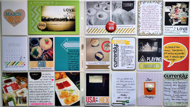
On Journaling: You can journal on any of these cards. I suggest using a permanent pen (I’m partial to the Sakura Microperm, but a slickwriter or sharpie pen would also work). I found that I like the soft art paper best for journaling. My pens seem to glide better on the art paper than any of the others, giving a more controlled feel to writing. I used the soft art paper option for the ‘noted’ journaling card in the lower left side of this project life spread.
Thank you so much for stopping by! If you have any questions at all please leave me a note below and I’ll be sure to answer as soon as possible. If you have ideas for future creative articles that you’d like to see here let me know!
Remember to connect with me throughout the week on Twitter, Instagram, and Facebook!